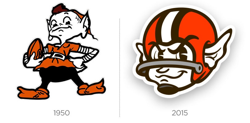
What if we got the chance to re-brand the Cleveland Browns? The recent hullabaloo over the Browns’ recent re-brand had us asking that question. After witnessing the April Fool’s PR stunt by division rival Cincinnati Bengals, we knew this was the perfect opportunity to turn our ideas into something tangible. When researching as much as we could about the Browns’ branding history, no element intrigued us more than Brownie the Elf. We knew there was enough history there to make Brownie the centerpiece behind our re-brand. Firstly, elves are mythical creatures.
No other NFL team can claim that. The most iconic iteration of Brownie was created in 1950, representing a time when the team was a winning, respected franchise in the NFL. This year marks 65 years since that particular Brownie the Elf logo was created, meaning it’s high time to resurrect him. Given Art Modell was the original reason Brownie is no longer with us, it only seems right to re-take Brownie for ourselves. It’s time to move on from the helmet, folks, and re-introduce a fresh version of an already-beloved mascot that actually evolves the Cleveland Browns brand (more than a helmet, anyway).
 Monogram Comparison
The re-designed logo is Brownie the Elf in an old school football helmet sporting updated brand colors (but using the same palette as the recent re-branding). The helmet is a subtle nod to the legendary contributions made toward the modern football helmet by Paul Brown, the first head coach of the Browns and the figure for which the team was named. Brownie’s look is one of composed determination and confidence.
Next up: typeface choices.
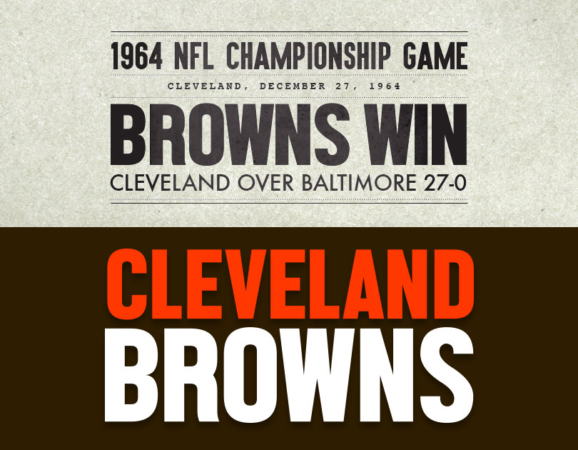
Keeping in line with the same inspirations for the mascot choice, I drew inspiration from various newspaper headline typefaces of the era. I imagined what that would look like with some free fonts that made sense one put together.
 Victory Text
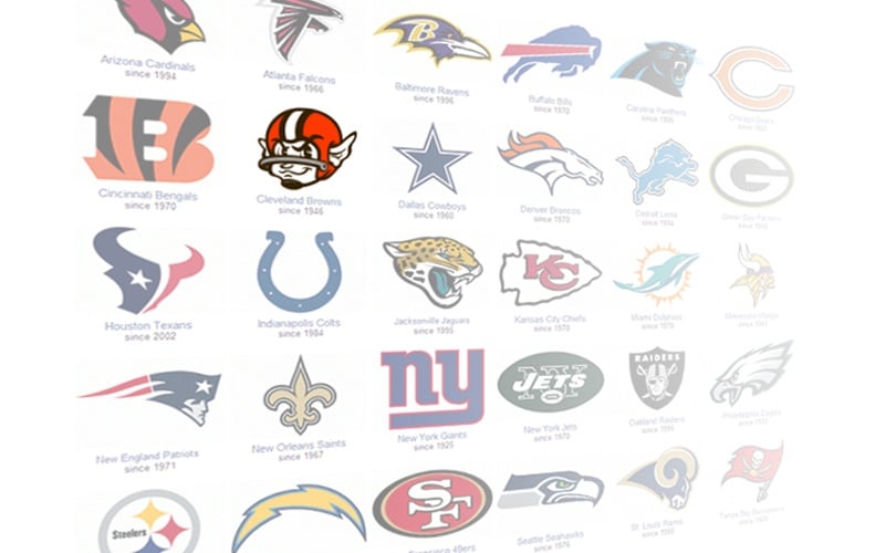 NFL Teams
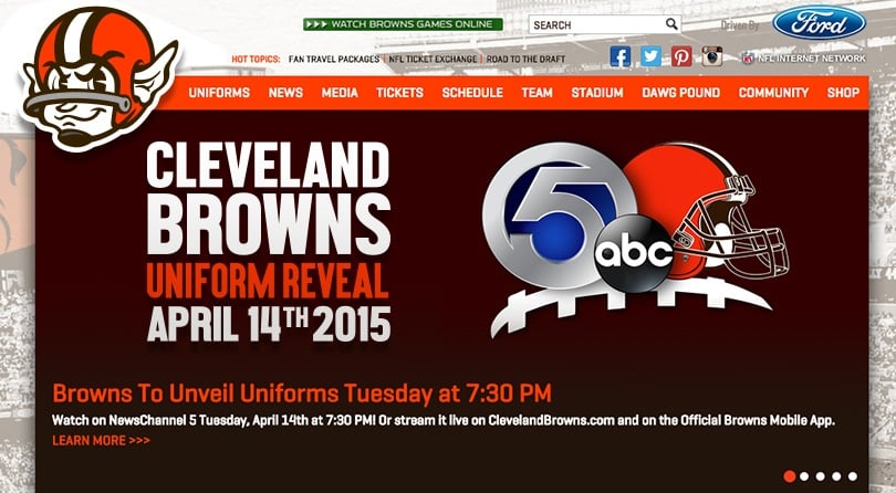 Website Mock Up
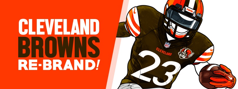
Here’s a proposed mock-up of the uniform unveiling announcement.
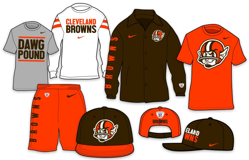
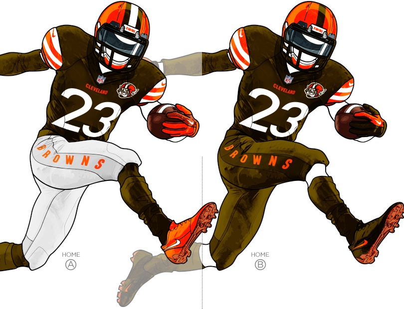
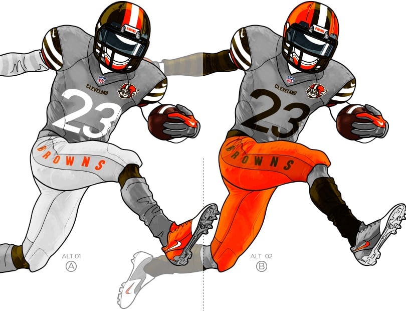
Given that the uniform unveiling is the main event of the re-brand, I explored several combinations and tried incorporating the classic Brownie attire as the inspiration for our proposed unis.
There are a few main departures in the uniform design from last year, including:
- Doing away with the jersey numbers on the shoulders and the pant stripes.
- Altering the jersey number typeface to give a modern feel to a classic look.
- Altered stripe system on sleeves to mimic the original Brownie’s striped sleeves.
- Adding the main Brownie logo to the uniform
- Adding the B R O W N S text on pant leg
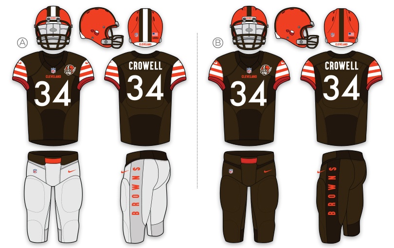
Home Uniform mockups
Away Combinations:
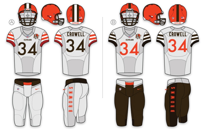
Away Uniform Combinations
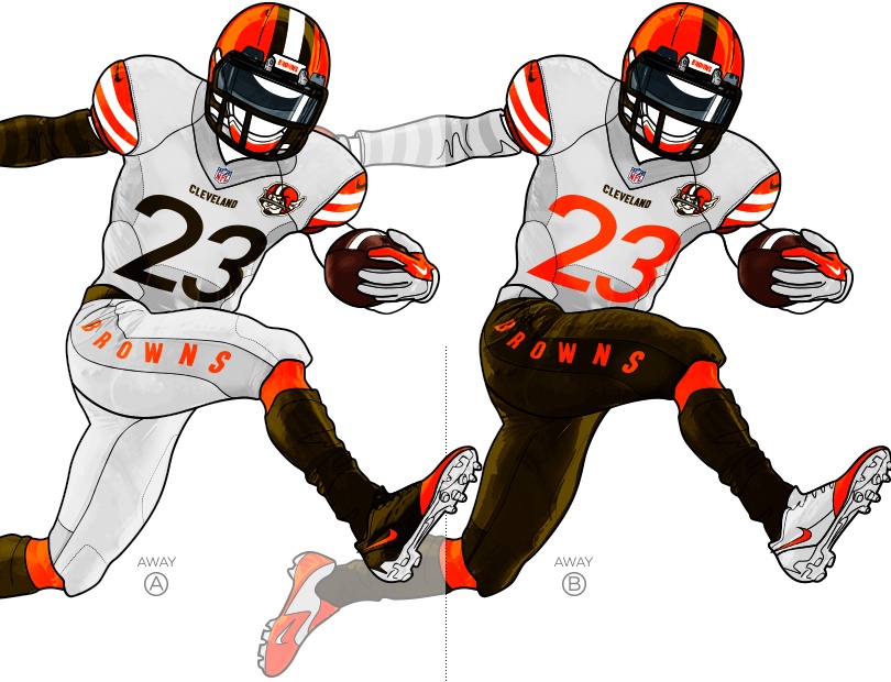
Away Uniform Mock Ups
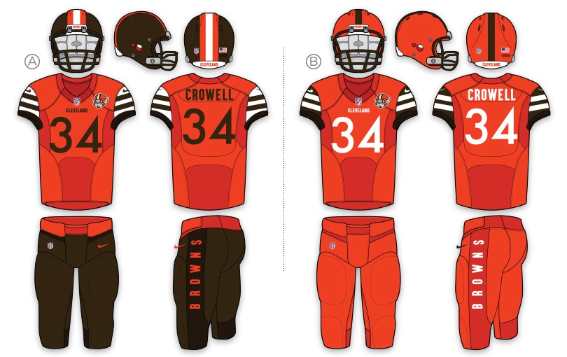
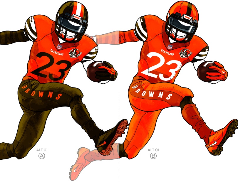
Browns 2015 Alternate Orange Uniform Mockup
Alternate Gray Combinations:
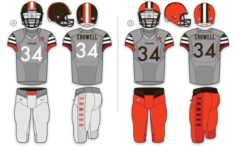
Browns 2015 Alternate Gray Uniform Combinations
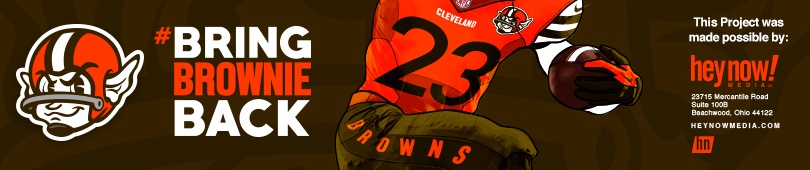
We don’t doubt the Browns will impress with their new uniforms when they reveal them tonight, but we feel strongly this doesn’t have to be the end of Brownie the Elf. It makes sense for Brownie to once again be the face of the franchise and if enough people engage, who knows? We know we want to #BringBrownieBack. You just might, too.
[button open_new_tab=”true” color=”#e2231a” image=”default-arrow” size=”large” url=”http://www.heynowmedia.com/portfolio/cleveland-browns-re-brand” text=”Visit Portfolio Piece” color_override=”#e2231a”]